Remodel One
The Remodel of a
Senior Assisted Living Apartment
Remodel one: This page is information and photos of a recent remodel of a senior assisted living apartment.
If one picture is worth a thousand words, hopefully this page is worth a lot more than that!
These before and after photos represent the results of a project I completed September 2008 for a disabled senior citizen who resides in an assisted living facility. Permission was obtained from the owner to repaint and remodel the apartment prior to the start of the project.
The major issues in this space were:
- No color or texture: bland white walls gave that institutional feel,
- Existing wallpaper was dirty, torn and smelled heavily of tobacco from the prior chain-smoking resident,
- Ugly brown paneling under counter,
- No focal point in room,
- Not enough curtains, pillows or fabrics for comfort/color/texture,
- Not enough storage: photos were covering kitchen counter due to lack of places to display them. Groceries, dishes and kitchen utensils were everywhere due to lack of organization and storage,
- No side table beside the chair for TV remote, glasses, etc.,
- Not enough art,
- Not enough greenery,
- Furniture was all on one side of the room which gave it an unbalanced feel.
These photos represent what can be done on a relatively small budget. Both rooms were completely remodeled for under $250. Due to the limited amount of storage, these pictures really do not do the project justice, but I hope they inspire you to tackle your project!
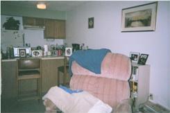
Before Photo 1: In this photo, you can see:
- The walls are institutional white. No color or texture exists in the room.
- The counter is cluttered with photos due to lack of area to display them.
- The bar chairs and the brown paneling are very unattractive and not very inviting.
- There is no side table for placing TV remote, displaying pictures or other items.
- Although not very clear in the picture, the magazines beside the bookcase were very unorganized and the chair is messy and the inexpensive blanket on the chair did not coordinate with anything in the room.
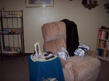
After Photo 1: In this photo:
- A warm sand tan was added to the walls.
- A faux mink throw was added to the chair.
- Blue and white fabric was used for accent pillows and also to slip cover the bar stools, which you can see in upcoming photos.
- This particular fabric was chosen to coordinate with a blue and white Chinese garden seat the resident owned.
- A side table was placed beside the chair and dressed in a table cover, and photo.
- The bookcase and garden rack were switched to better balance the furniture in the room.
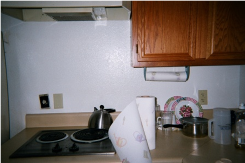
Before Photo 2: In this picture, you can see:
- The bland white walls. No color or texture exists.
- There is not enough art or other objects to personalize the space.
- The counter is cluttered and is very unorganized.
- There is no clock in the space and food items are not accessible to the stove area.
- Paper towels are too near the stove and present a safety hazard.
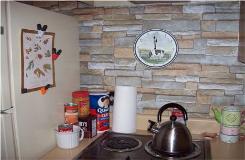
After Photo 2: This is the same view as the before photo above:
- This time, a stacked stone wallpaper was added to the wall behind the stove giving it color and texture. It also coordinates with the other room as you will see in the photos below.
- Clutter was reduced and items were organized.
- Due to this person's particular disabilities, food items were placed for easy accessibility.
- The paper towels are still near the stove, but the use of a holder keeps them away from the hot surfaces, reducing the possibility of fire hazard.
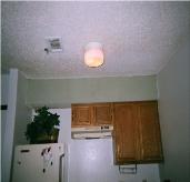
Before Photo 3: This view of the stove area shows:
- The bland white walls as well as the torn, ugly wallpaper above the cabinets.
- The wallpaper also had a heavy smoke odor left over from the prior chain-smoking resident.
- Although this resident has a silk ivy on the refrigerator, it doesn't have color or texture behind it to make it stand out.
- The walls to the right of the stove are institutional white.
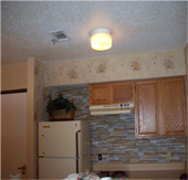
After Photo 3: This photo shows:
- The addition of not only the stacked stone wallpaper, but also a replacement of the wallpaper above the cabinets.
- This rose wallpaper was picked by the resident who was very fond of roses.
- The rose wallpaper was continued on the wall beside the refrigerator.
- The background color in the rose wallpaper picked up the sand color in the stacked stone paper.
- These colors coordinate with the sand tan on the rest of the walls.
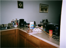
Before Photo 4: You can clearly see:
- The bland white walls in this photo.
- The few existing pictures don't "pop" on the white walls.
- The counter clutter happened because the resident lacked sufficient places to display photos and containers to contain kitchen clutter.
- The cords from the various electrical kitchen appliances posed a potential health hazard
- Food needed to be accessible, but in an organized fashion.
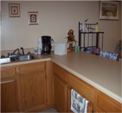
After Photo 4: Now you can see:
- The sand tan paint color in this photo has warmed up the walls
- Additional decorative photos of the resident's favorite flowers now "pop" against the color on the walls.
- The addition of storage containers allowed the resident to keep items needed within reach, but out of sight.
- Counter clutter was eliminated by placing family photos on shelves in the living room which were added during the remodel.
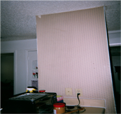
Before Photo 5: Continuing:
- The ugly and smelly wallpaper was torn and was not to the resident's liking.
- There is no art on this wall, and the counter is cluttered.
- The toaster oven is facing the living room instead of the kitchen.
- The toaster oven cord is dangling and could present a safety hazard.
- Items are scattered on the counter.
- The bland white walls and cluttered closet door can be seen in the background.
- This small area has four doorways presenting additional clutter to the eye.
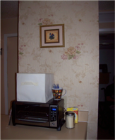
After Photo 5: After:
- This rose wallpaper was more to the current resident's liking.
- Art was hung on the wall.
- The toaster oven was placed against the wall.
- A covered container on top of the toaster oven stored the additional small items that needed to be accessible.
- The counter was reorganized.
- In the background, you can see the addition of color to the walls, removal of the great grand children's artwork
- The closet door was painted to match the walls to reduce the eye clutter of too many doorways in a small space.
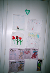
Before Photo 6: As stated above:
- This apartment had four doors all within a very small area: door to hallway, door to bathroom, closet door and bedroom door.
- This made the area look small, cluttered and was very distracting.
- The resident displayed her great grand children's art by taping them to this door, which was not good for the art or the door.
- Although the art needed to be kept, it needed to be displayed in a better fashion.
- The children also placed many decorative stickers on the door, which ruined the finish on the door.
- This door was in a walkway, and art was knocked to the floor when people passed by.
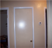
After Photo 6: After:
- This photo really shows the rich warm sand tan wall color that was used.
- The middle of the four doors was painted the same color as the walls to reduce the visual eye clutter from too many doorways in a small area.
- The children's artwork was removed to another area and displayed properly.
- The lighting was accentuated in this space and reflected off the wall color.
- A semi-gloss, high quality paint was used in this project.
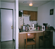
Before Photo 7: Typical of many low-cost senior living spaces:
- The bland white walls are cold.
- The lack of color and texture in this space makes it feel impersonal.
- The bar stools are covered in an ugly brown vinyl and the dark brown unattractive paneling is equally bad.
- This photo shows the extremely cluttered counter. Kitchen appliances, photos and food all juggle for space.
- There is not enough art or storage space in these areas.
- The wallpaper above the kitchen cabinets is old, worn, smelly and desperately in need of replacement.
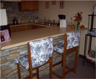
After Photo 7: After:
- The warm color on the walls made the apartment feel more like a home.
- The ugly paneling under the counter was covered with a stacked stone wallpaper that added weight to the counter as well as color, texture and additional warmth and character.
- It was repeated on the wall behind the stove to add texture there and to tie the two rooms together.
- The brown vinyl bar stools were slip covered with a blue and white fabric that coordinated with the resident's Chinese garden seat.
- Additional art was hung over the kitchen sink to personalize the space.
- The counter clutter was addressed, and additional seasonal accessories helped to create more of a home feeling in the space.
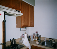
Before Photo 8: Again:
- Bland white walls and the lack of color and texture left the resident feeling cold and unwelcome in the space.
- There was little art or personal touches on this side of the kitchen.
- Dishes were hard for the resident to reach in the cupboards.
- As she had no funds to remodel the space, the resident's family had the work done while she was away for three weeks and presented this to her as a surprise on her return.
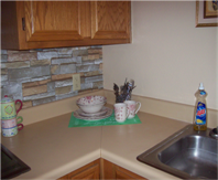
After Photo 8: After:
- The addition of color on the walls and wallpaper for color and texture made this assisted living apartment feel warm, welcoming and more home-like.
- Additional art was added over the kitchen sink for a personal touch.
- Counter clutter was addressed, and the dishes are now placed in an area that is accessible to the resident for daily use but in a more organized fashion.
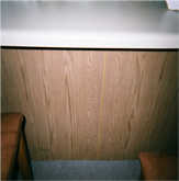
Before Photo 9: This close up photo of the paneling was taken to show just how unattractive it was. You can also clearly see the equally unattractive brown vinyl on the bar stools as well. Neither was very pleasing to the resident who lives here.
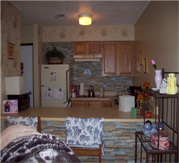
After Photo 9: The warm colors on the walls, the color and texture contributed by both the rose and stacked stone wallpaper create a warm, welcoming environment for this resident. The colors are in the same tonal family and coordinate well with each other despite the fact they are very different patterns. Adding storage, clutter control, art and accessories gave this senior a delightful space to return to.
Links to Other Information
Go to: Before and After
Click the lavender bar on the left and subscribe to the RSS feed to be notified of new listings as they become available.
Did you like this? Please share it! Thanks in advance.
No matter where you are in life (stay-at-home mom, full or part time employee, retired, etc.) you can make a good income with a website. Whether you write books, make crafts or something else, I highly recommend SBI. It's the reason for this website. Check it out below and become another solopreneur!
Hello! This is Shelly Morton, the author of this website. I know you hear a lot of hype about making money from home and building a successful website. I speak from experience as a solopreneur, I have succeeded with Solo Build It! There is simply no better way to build an online business. Nothing else compares. It's not a "get rich quick" scheme. SBI provides you with all the tools and tips you need to be successful. You put in the work and SBI will help you succeed! SBI is simply the BEST way to get started for any "solopreneur."


